Gauge Widget
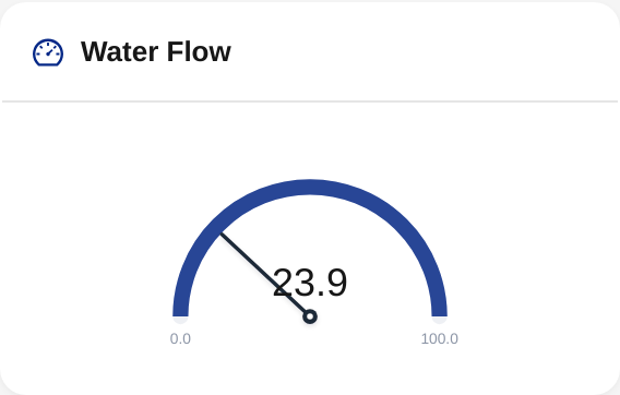
A visual gauge for values that map onto a fixed range. The Gauge widget supports radial dials, circular donuts, horizontal and vertical bars, animated liquid tanks, battery icons, signal bars, and compass headings.
What it shows
A reading positioned within a min/max range, rendered as one of eight gauge styles. The current value is shown in numerals on the gauge, with the active color band's label beneath it (radial and circle).
Field types supported
Numeric only. Bind to a Number-typed field (data, mapping, or formula). If you pick a field that is not numeric (text, boolean, and so on), the config drawer warns you and the gauge will not render a value, so check the field's type on the Fields tab if the gauge shows no reading.
Configuring a Gauge widget
Basics tab
| Field | What it does |
|---|---|
| Title | Header text (required, max 120 chars). |
| Subtitle | Optional smaller text (max 200 chars). |
Style tab
This is where you pick the gauge's visual personality.
Quick presets
The fastest path to a good-looking gauge. Pre-configured combinations of gauge type + range + color bands:
- Battery - Battery icon, 0-100%, green/yellow/red.
- Signal strength - Discrete bars, 0-100%, weak/medium/strong colors.
- Fluid tank - Liquid wave, 0-100%, level-based colors.
- Temperature (°F) - Radial dial, sensible temperature range, cold/comfortable/hot bands.
- Humidity - Radial dial, 0-100%, dry/comfortable/humid bands.
- Speedometer - Radial dial, 0-200, green/yellow/red.
- Wind direction - Compass, 0-360°.
Pick a preset to set everything in one click. Editing any setting afterward clears the preset chip.
Gauge type (without preset)
| Type | Best for |
|---|---|
| Radial | The classic dashboard gauge. Semi-circular arc with a filled progress fill (or an optional needle). |
| Circle | Full 360° donut. Looks modern; good for percentages. |
| Linear-H | Horizontal bar. Compact; good for narrow widget slots. |
| Linear-V | Vertical bar. Resembles a thermometer or fluid level. |
| Liquid | Animated wave inside a container. Eye-catching for tank-fill or container metaphors. |
| Battery | Stylized battery cell icon. Fixed 0-100 range. |
| Signal | Discrete signal bars (3, 5, or 7 bars). Fixed 0-100 range, maps to bar count. |
| Compass | Direction needle on a compass rose. Fixed 0-360° range. |
Style options
| Field | What it does |
|---|---|
| Show value text | Numerals alongside the gauge (default on). |
| Show min/max labels | Labels at the extremes of the gauge. Used only when the numeric scale is off. |
| Use needle (radial) | If on, shows a pointer needle. If off (default), shows a filled progress arc. |
| Wave animation (liquid) | Animated ripple effect (default on). |
| Number of bars (signal) | 3, 5, or 7 bars. |
| Band thickness % (radial / circle / linear) | Thickness of the gauge's fill band, 4-40%. |
| Show color zones | When on, shows each configured color band so users see where the value sits across the range. |
| Zone style (radial / circle) | Ring keeps a slim segmented band ring outside a neutral track (clean). Track paints the color zones across the main arc (saturated). |
| Show tick marks (radial / circle / linear) | Graduated minor and major ticks around the dial / along the track. |
| Show numeric scale (radial / circle / linear) | Numbers at the major ticks. When on, these replace the bare min/max labels. |
Range tab
| Field | What it does |
|---|---|
| Min | Lower bound. auto or an explicit number. |
| Max | Upper bound. auto or an explicit number. |
Battery and Compass gauge types lock the range (0-100 and 0-360 respectively).
auto derives the range from recent data with a ±10% padding so a single reading doesn't sit at the very edge.
Appearance tab
| Field | What it does |
|---|---|
| Unit | Display unit override (max 16 chars). |
| Decimals | 0-6 places. |
| Prefix / Suffix | Text before/after the number (max 8 chars each). |
| Abbreviate (K/M/B) | Compact large numbers. |
| Background color | Hex; defaults to white. |
Color bands tab
This is where you author the gauge's color story. Unlike Value and Chart (which use threshold rules with operators), Gauge uses ranges:
Each band has:
- From value (inclusive).
- To value (inclusive).
- Color (hex).
- Label (optional, max 32 chars).
Bands paint in order. The current value's fill color comes from the first matching band.
Example: battery preset bands
| From | To | Color | Label |
|---|---|---|---|
| 0 | 19 | #d11 | Critical |
| 20 | 49 | #e80 | Low |
| 50 | 100 | #0a8 | OK |
Bands also drive the color-zone display (ring or track) when enabled.
On radial and full-circle gauges, Show band labels on the gauge (toggle under the Color bands tab) controls whether the active band's label appears next to the value. Turn it off to keep your band labels for authoring but hide them on the widget; the value re-centers when no label is shown.
Aggregation & period
| Field | What it does |
|---|---|
| Aggregation | avg, min, max, sum, last, count. Defaults to the field's natural aggregation. |
| Period | inherit (use dashboard time picker) or absolute (15m, 1h, 6h, 24h, 7d, 30d). The aggregation runs over every reading in the period. |
For "current value" gauges, use last and inherit. With last, a gauge whose device reports less often than the dashboard's selected time range falls back to the last known reading and shows an "as of" caption with that reading's timestamp, instead of rendering empty.
Tips
- Match the gauge type to the metric. Battery levels use the Battery preset; tank levels use Liquid; orientation uses Compass.
- Set explicit min/max when the natural range matters. Auto-range is fine for screen-fitting but it shifts as data changes.
- Use 3 color bands rather than 5+; gauges are read at a glance and more bands hurt legibility.
- The color zones are helpful at a glance. The default ring style stays clean; switch to track style (or toggle zones off) if you want a different emphasis.
- For very tight ranges (e.g., a pressure sensor that varies by 0.1 bar), use small decimal places + tight min/max so the gauge actually moves.
When to use a different widget
- For just a number, no range needed -> Value widget.
- For a state ("Healthy" / "Warning" / "Failed") -> Status widget.
- For trends over time -> Chart widget.